Welldoing
The UK's No.1 Therapist Matching Platform

Platform UI/UX
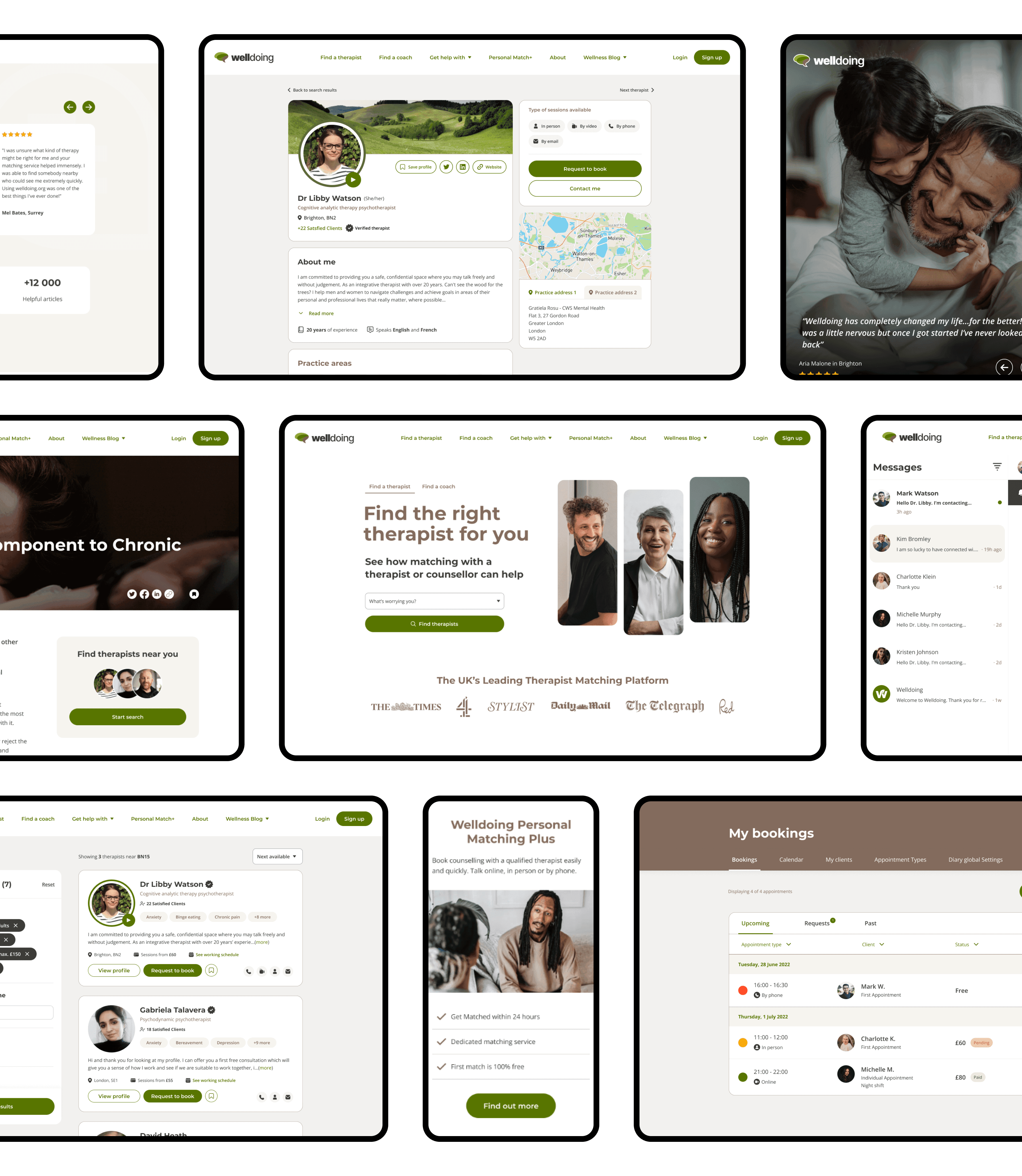
I set out to simplify the process of finding the right therapist by creating a user-friendly platform tailored to both clients and practitioners. With intuitive search filters and detailed profiles, clients can easily find the perfect match for their needs.
For practitioners, I designed a comprehensive booking system that handles seamless transactions and recurring appointments, all managed through an easy-to-use dashboard. I also accounted for the unique needs of both therapists and coaches, ensuring their profiles and session types were accurately represented.
Understanding the importance of communication, I developed a chat system with custom features, including booking appointments directly within the chat for quick access.
I also designed a content hub, organising thousands of articles for users to easily filter and explore relevant wellbeing content.
To round off the re-design, I overhauled the entire front-facing brochure site, enhancing dynamic landing pages, about sections, and a recommendation hub to further enrich the user experience.
Booking Flow
Here's a quick look at the booking flow I designed for Welldoing. Clients can effortlessly find the right practitioner using simple search filters and book directly on the platform with just a few clicks.
The system also supports recurring bookings and regular payments, making the process smooth and hassle-free.
For practitioners, I developed a user-friendly dashboard to manage bookings, clients, and payments efficiently. Watch the demo to see how it all comes together.
Branding
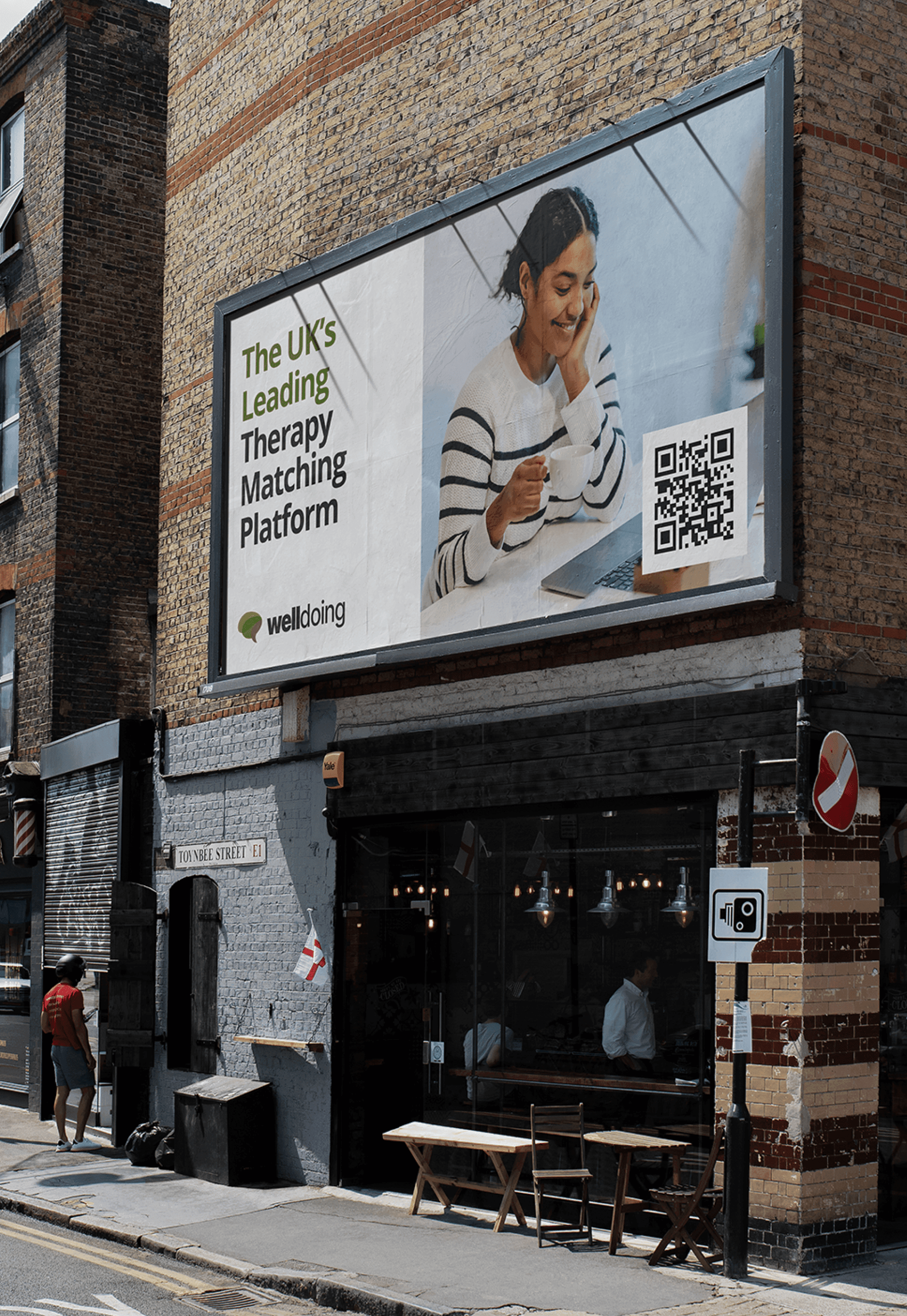
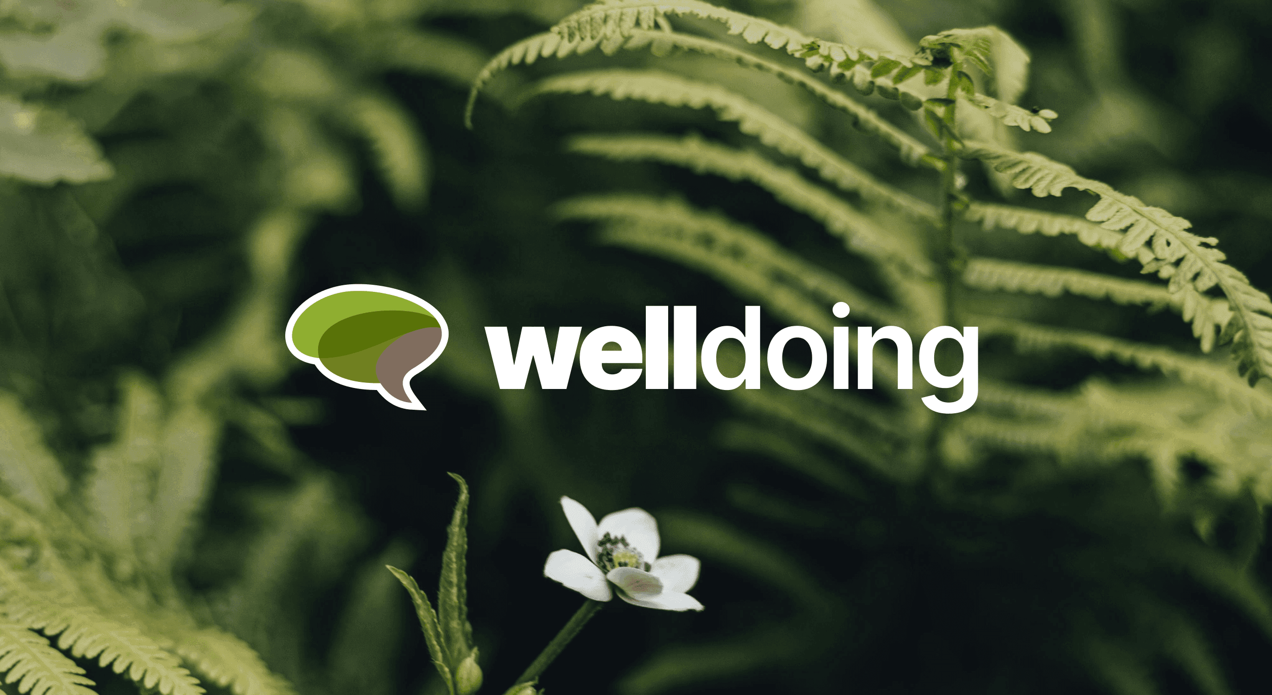
Welldoing was ready for a fresh start, so I led a complete rebranding effort. I began by exploring their core values and developed three distinct themes: Classic, Calm, and Professional. Each theme was paired with unique design concepts, giving the client a range of options. Ultimately, the 'Calm' theme stood out, offering a sense of peace and security that aligned perfectly with the brand’s mission.
For the logo, I kept the strong, professional typeface but added distinction between the words by adjusting the font weight. I also designed a logo mark that embodies the mental health and wellness industry, combining a chat bubble with a tree to represent communication and nature’s calming influence.



Thank you for taking the time to explore my work on the Welldoing platform. The new platform is set to go live in Q4 2024, but in the meantime, I invite you to visit their existing website to learn more about the current services they offer.
Go to website